top of page

Libby
BRAND STRATEGY // STYLE GUIDE // PHOTO ART DIRECTION // WEBSITE // PACKAGING
Brand Launch
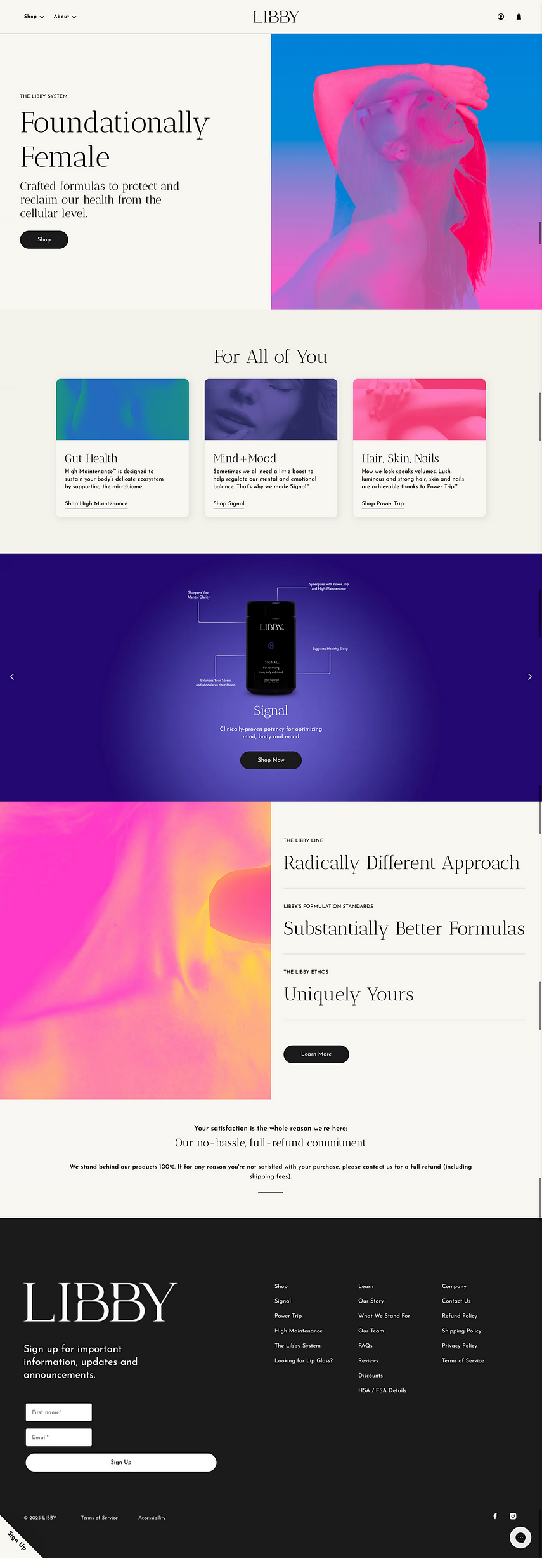
The launch of Libby debuted a line of premium supplements for women with science-backed clean formulations to revitalize from the inside out–from gut health, to focus, to hair, skin, and nails. The brand is about embracing beauty in the present, and taps into the female spark that is with us through every stage of life.
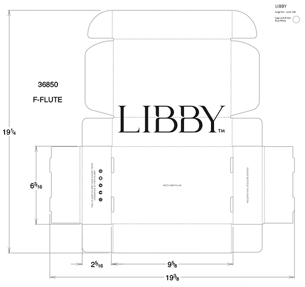
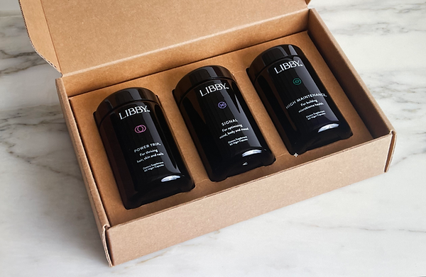
The concept for the branding visualizes the multi-dimensional female with dramatic overlays that radiate grace and beauty with power. This duality is present throughout all visual elements of the brand’s identity, from the logo, to gradients, and photography. Sustainable and luxe packaging form factors were selected to appeal to a health-conscious and environmentally-conscious consumer. Custom die cut shipping boxes create a premium unboxing experience while the ultraviolet bottles come with refillable supplement pouches.


bottom of page